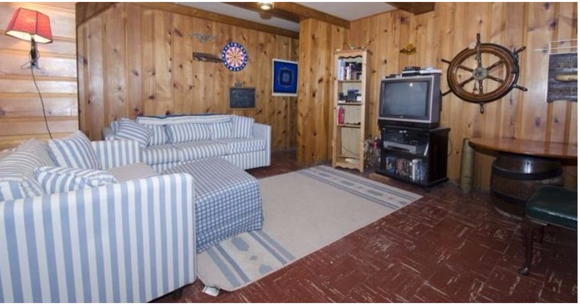
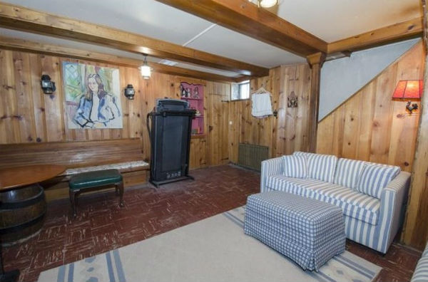
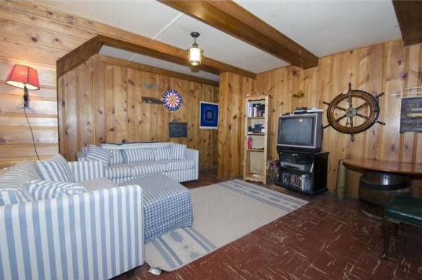
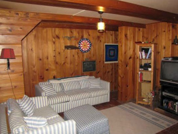
Take a look at this dingy, wood-paneled basement and ask yourself "Does this look like a room in an interior designer's home?"
No, Michelle Gage didn't think so either. The designer from Pennsylvania and her husband Alex have been renovating their 1920s home room-by-room. The couple have also been sticking to a tight budget for each project, which means we can all learn a thing or two from Michelle's thrifty, creative solutions.
Recently, she set aside $1,000 and decided to tackle one of the most challenging areas of her home: the basement. It looks like it's stuck in the 1970s, with wood-paneling and a red tiled floor. The room also had some strange features, like a church pew seat attached to one of the walls.
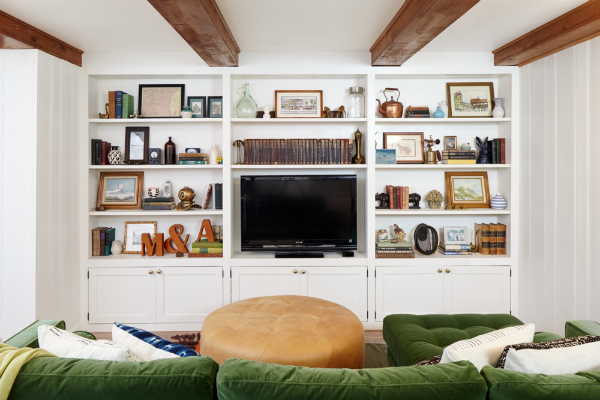
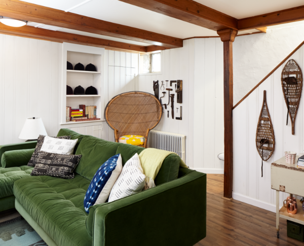
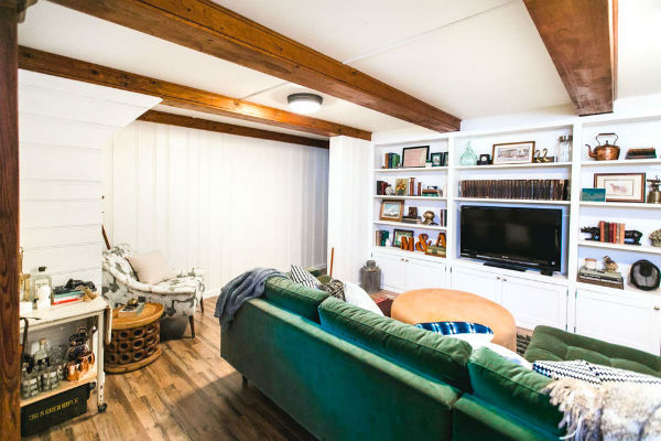
But it's the only room in the house with a television, so it was overdue for some TLC. Gage wanted to make her dark, stuffy and outdated basement into a modern and inviting home library and TV room. Incredibly, she pulled it off while staying under-budget.
And the "after" photos will make you want to copy her style...
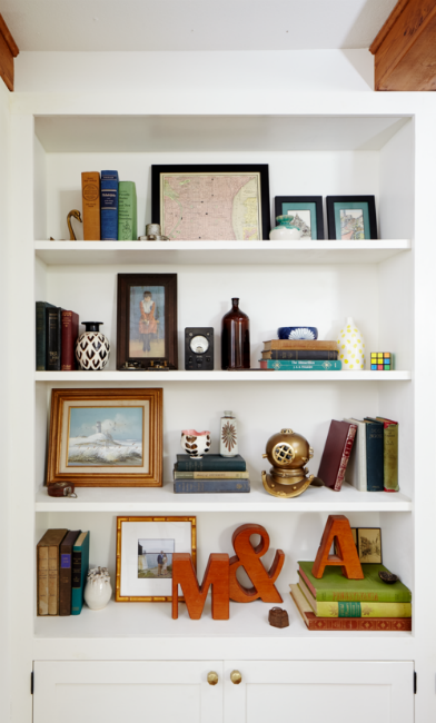
The biggest addition to the renovated room was the massive custom shelving unit built by Gage's husband.
"We spent half of the budget on creating a custom shelving unit and the other half on paint and flooring," the designer told Today. And it was money well spent, because the fresh coat of white paint makes the room much brighter and more inviting. But ripping the wood panels off the walls was much easier than changing the flooring.
It turned out that those ugly red tiles were actually asbestos tiles, and were unsafe to remove. Instead, Gage found faux-hardwood tiles that snap together like Lego and fit right on top of the existing tiles. They look like the real thing, but they're a lot cheaper and easier to put together.
Of course, not everything had to go. While the wood ceiling beams didn't stand out in the old room, they add character in the new one because they don't blend in to the walls anymore. Gage has a free home makeover tip for anyone who wants to try a similar project:
"We didn't try to make the room do too much," she said. "It's our only TV space and we let it just be that. We didn't try to make it a TV room/office/guest room." Also, while Gage transformed the room under budget, she left extra space for the cost of new furniture and accessories.
You can see more of Gage's renovations - including other rooms in her home - on her website.
Share this awesome renovation with someone you know!
[H/T: Today, Design Sponge]
