I love a puzzle that challenges you to spot something hidden in plain sight.
If you do too, you'll be happily surprised to learn that some major companies hide secret meanings in their logos.
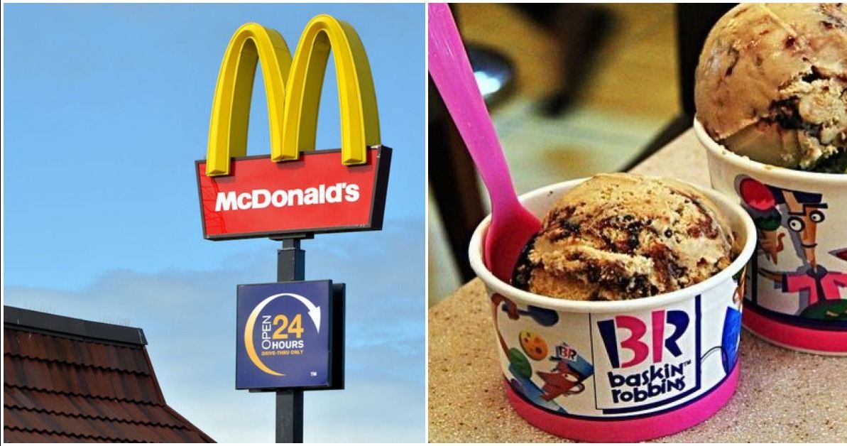
Even if you see the golden arches or the Pepsi "globe" every day, I bet you don't know what they're supposed to represent.
See how many of these 30 logos with hidden meanings you already know about:
1. Toblerone
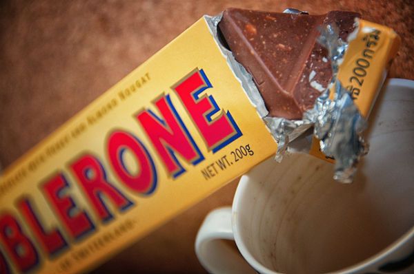
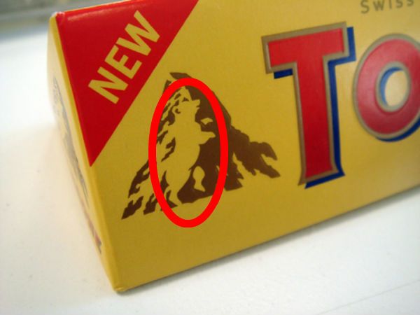
A piece of trivia about Bern, Switzerland, the home of this popular candy bar, will help you spot its hidden logo.
Bern is known as the "city of bears," and a friendly bear is even lurking in the mountains on Toblerone's packaging.
2. Tostitos
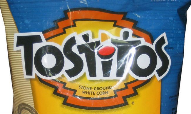
You'll kick yourself after seeing this one: in the middle of the chip brand's logo, two t's are enjoying a chip, with dip in the lowercase i's dot.
3. Toyota
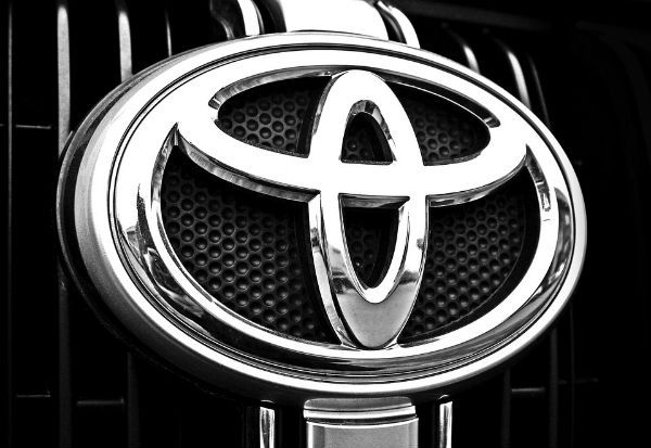
You don't have to be a car lover to appreciate this crafty logo. You can find every letter of "Toyota" inside their signature grill ornament.
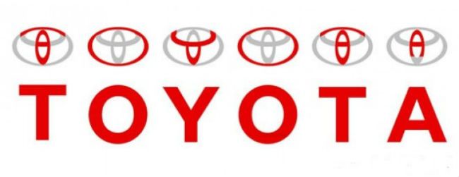
The actual design symbolizes "the unification of the hearts of our customers and the heart of Toyota products."
4. Apple
The story behind how this tech giant settled on their name is famously vague.
Theories include that the apple represents knowledge, or that Steve Jobs thought the name was fun.
What we do know is that designer Rob Janoff included the bite "for scale, so people get that it was an apple not a cherry."
5. Amazon
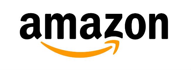
Their clever logo says everything you need to know about this online retailer: they offer everything from A to Z, as the yellow arrow points out.
It also makes a smile, which is hopefully how you react when your Amazon package arrives.
6. Orbit
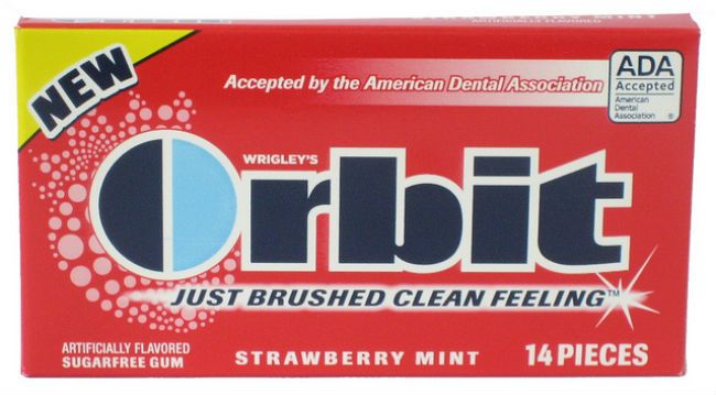
There's a playful reference to this gum brand's name in their logo.
One half of the O is dark, the other is light. Just like the earth as it orbits the sun.
7. Levi's
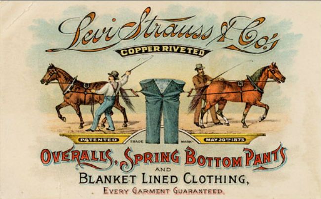
Levi Strauss - America's original jean maker - used a pair of horses pulling his pants to show how tough they are.
In the 1920s, the company adopted their new logo, and its meaning might not be so innocent.
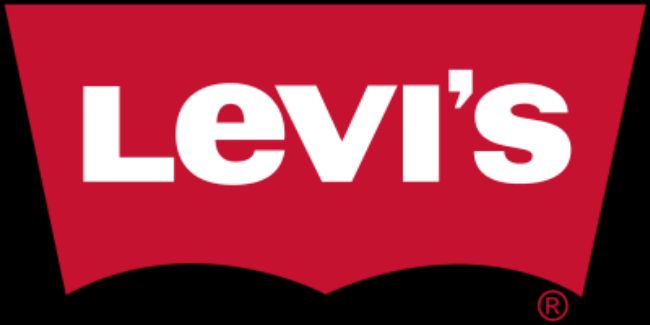
The company says the design is inspired by the "batwing" shape of their pockets.
You'll notice it also resembles the "assets" your jeans are meant to enhance.
8. Sun Microsystems

Look closely. The swirling design next to this tech company's name actually reads "sun" over and over again in a loop.
9. Cisco
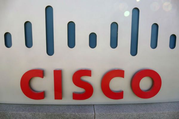
Another computer system company with a clever logo. The bars in this design symbolize both connectivity, and the towers of the Golden Gate Bridge.
That's because Cisco is based in San Francisco.
10. NBC
The TV network adopted their peacock logo - simply called "the bird" - to show off their lineup of color programming in the 1950s.
Today, the bird's feathers each represent a different part of the company.
From left to right: news, sports, entertainment, stations, networks, and productions.
11. Pinterest
This social media website imitates a cork board, where you can save ideas for crafts and recipes that you like.
So, naturally, their logo is based on a pushpin.
12. Tour de France
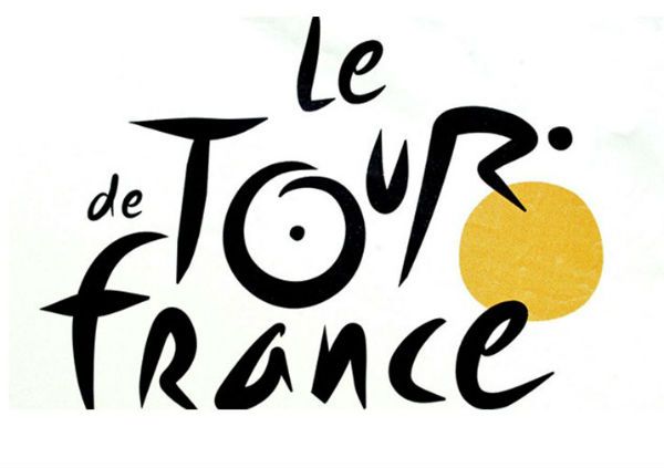
Notice the stylized O in this photo? And the gold circle?
Now look closely at the R in "tour" and tell me what you see.
That's right, a bicycle racer competing in the Tour de France.
13. Wendy's
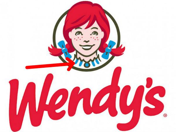
When people spotted that this fast food chain's logo features the word "Mom" in the mascot's collar, they cooked up all sorts of crazy theories.
Was it meant to subliminally convince us Wendy's tastes like "Mom's cooking?"
The company says no, the hidden message was "unintentional."

For the record, Wendy's founder Dave Thomas named the chain for his daughter Melinda Lou, nicknamed Wendy.
14. Fed Ex
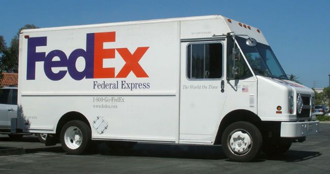
Designer Lincoln Leader won a lot of awards for creating this delivery company's brilliant logo.
The space between the E and x in Ex creates an arrow, suggesting speedy deliveries without being too obvious.
15. The Bronx Zoo
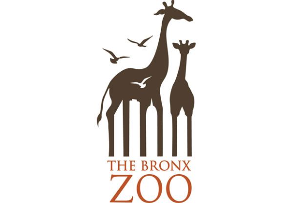
Read between the lines to see the hidden image in this logo.
The spaces between the giraffe's legs make skyscrapers, connecting the zoo's animals to the urban jungle around them.
16. Baskin-Robbins
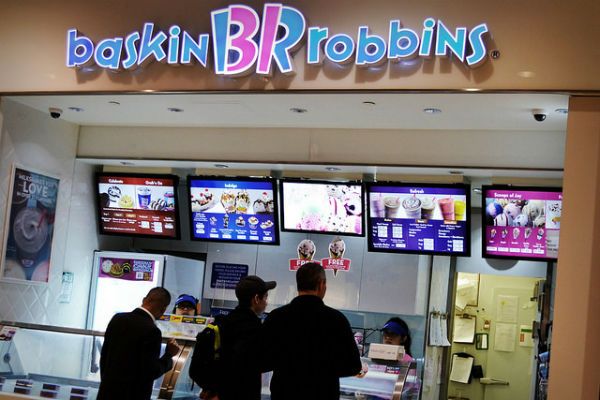
Can you spot how the ice cream chain pays homage to their famous 31 flavors in this logo?
Look at the B and R - the pink sections of the letters make 31.
17. Domino's
The pizza chain's founders originally planned to add a dot on their domino for every new location they opened.
They scrapped the plan because the business took off too quickly, leaving it at just three.
18. Beats
This is pretty clever: this headphone brand's logo is a B, for Beats, but the design also looks like a pair of white headphones on a red head.
B for brilliant.
19. Adidas
Even this German sportswear company's logo is inspiring.
Adidas has always been famous for its three stripes, but they turned the design on an angle to represent a mountain - a challenge to be overcome.
20. Hershey's Kisses
Here's another logo with a secret hidden image. Can you spot it?
Look at the space between the K and I. It's in the shape of a Hershey Kiss, turned on its side.
21. Pepsi
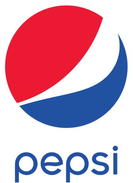
Even Pepsi is not sure what their signature "globe" is supposed to represent.
The soft drink giant paid more than $1 million to refresh their design in 2008, choosing a new twist on the same red, white and blue circle.
Many people point out that the white space looks like a smile, but it's a little more complicated.
In a 27-page report, the company behind the globe compared their design to Earth's magnetic field, Chinese feng shui, Pythagorean math, geodynamics, and Einstein's theory of relativity.
22. Goodwill
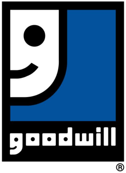
Bet you never noticed this before: the smiling face in the discount store's logo is really the stylized G from their name.
Reusing the same design feature twice is thrifty, just like the store itself.
23. Gillette
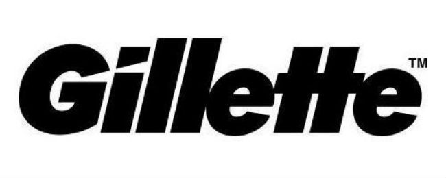
The razor company's graphic designer was pretty sharp. They included a "cut" through the i, to show how sharp Gillette razors are.
24. Formula 1 Racing
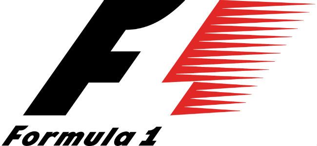
Here's another "spot the hidden design" logo, but it's probably the easiest one on the list.
The space between the F and the burning speed lines make the number one, while the logo is titled to represent speed.
25. McDonald's
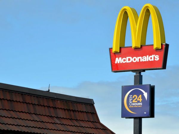
The McDonald's M and the golden arches logo are inseparable today. But in fact the arches were introduced much earlier.
The huge golden arch was a feature of the burger chain's earliest franchises, meant to attract customers driving by.
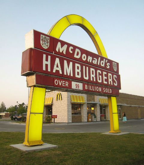
The gold McDonald's M was only introduced in the 1960s.
Market researcher Louis Cheskin said the iconic symbol became popular because it brings to mind "mother McDonald's breasts."
26. Hope for African Children Initiative

How do you raise awareness for your charity?
Start with a brilliant logo, like this one. The space between the child on the left and the adult on the right form the continent of Africa.
27. Pittsburgh Zoo & PPG Aquarium
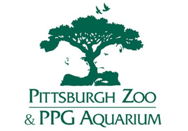
Some of the zoo's most famous residents are hiding in the white spaces on the sides of their logos.
Can you see them?
28. LG
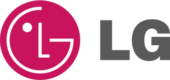
LG stands for the Korean company's name, Lucky Goldstar, but also for their slogan, "life's good."
Their logo says the same thing, with a winking face made of the letters L and G, designed to make the electronics brand more friendly.
29. Google
You probably use the search engine every day, but do you ever wonder why the l in Google is green?
It just doesn't fit the primary color scheme (red, yellow and blue) used by the other letters in the logo.
Well, that's on purpose. Designer Ruth Kedar says the green letter shows "that Google doesn't follow the rules."
30. Hyundai
Hyundai obviously has a lot of respect for their customers, because it shows in their logo design.
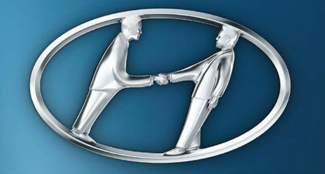
The H in their grill ornament is actually a pair of figures shaking hands, symbolizing the connection between Hyundai makers and drivers.
Did you know about any of these hidden meanings already?
