We all know the value of an eye-catching logo. The more a product sticks in your mind, the more likely you are to think of it.
But some companies hide secret messages, special symbols, and double meanings in their logos. Here are 15 really common designs with meanings you probably never knew about.
1. Google
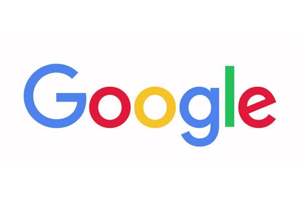
Now that we turn to the almighty Google for all our answers, we're used to seeing this logo everywhere. But did you notice that one of the letters doesn't fit in?
While the Gs, Os and E are in red, yellow, and blue (primary colors), the L is green. This is on purpose. As graphic designer Ruth Kedar explains, "we put a secondary color on the L, which brought back the idea that Google doesn't follow the rules." Such rebels!
2. Pinterest
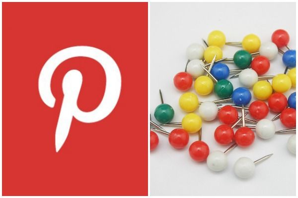
This social media app's users know that it works like a digital cork board, where you can "pin" recipes, projects, articles, and anything else that interests you. To fit that theme, the capital P is actually drawn to resemble an old fashioned push pin.
3. Hyundai
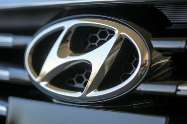
There's all kinds of hidden meanings behind the H on the front of your Hyundai. Slanting to the right is meant to make the letter look "aggressive," but there's a soft touch to the design too.
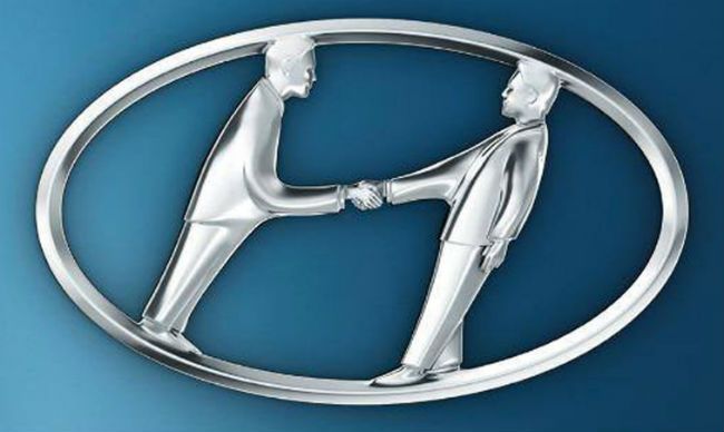
The logo is meant to be a silhouette of a Hyundai representative shaking hands with a satisfied customer.
4. Toblerone
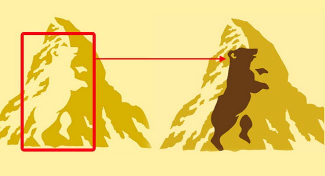
See anything in this chocolate company's logo? Here's a hint, Toblerone comes from Bern, Switzerland, which is called "the city of bears."
Yes, there's a bear nestled into the negative space of the mountain. Now you'll never be able to "unsee" it.
5. NBC
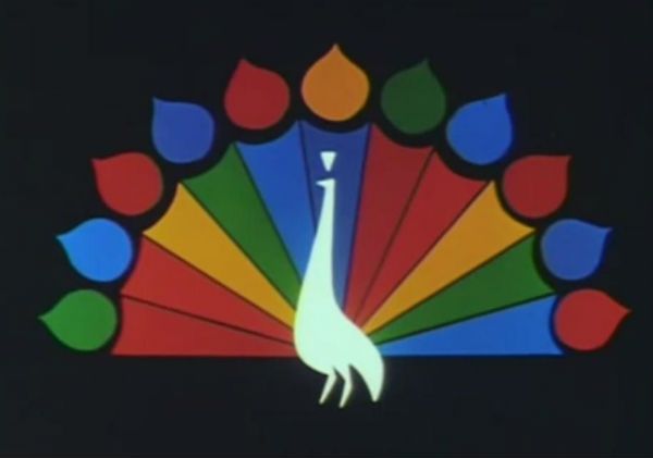
The TV network had tried a handful of logos before settling on "the bird," a bright and colorful peacock meant to remind people about the channel's lineup of programs in color (a novelty in the 1950s).
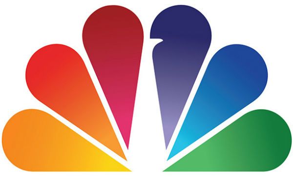
The original peacock's tail feathers were paired down to six in 1986, representing the network's six divisions. From left to right: news, sports, entertainment, stations, network, productions.
6. Toyota
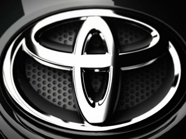
There's a lot of special meanings packed into this one car company logo. The three ovals are meant to represent "the unification of the hearts of our customers and the heart of Toyota products," while the background "represents Toyota's technological advancement and boundless opportunities ahead."
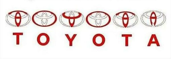
Meanwhile, the clever design also spells out "Toyota" with just one shape. See how it's done:
7. LG
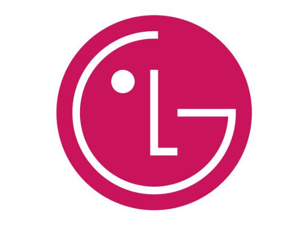
This electronics giant wants you to remember "life's good," but the letters also stand for the company's original name, Lucky-GoldStar.
But did you realize the logo is a winking face? The L and G created a friendly face meant to make the company seem more inviting.
8. Cisco
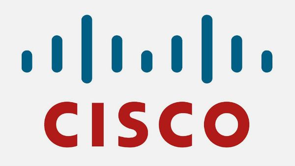
This internet networking company puts their logo on a lot of products, and if you're not looking carefully you might miss the significance.
The blue shapes that look like a WiFi signal (or an electromagnet's pull) are meant to be the Golden Gate Bridge. Cisco is from the Bay Area, hence they're named after San Francisco.
9. McDonald's
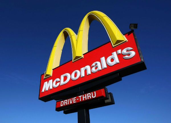
The connection between the golden arches and the giant M in this fast food chain's logo seems like it was meant to be.
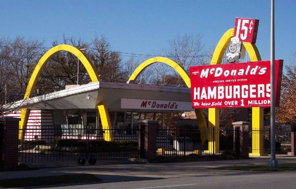
But the arches pre-date the logo by 10 years. Originally, the single gold arches were an eye-catching feature for McDonald's restaurants. When the company re-branded in 1962, they doubled up the arches for the iconic McDonald's M.
10. Sun Microsystems
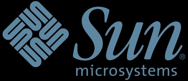
Another tech giant whose logo is probably stamped somewhere in your office. In case you haven't spotted it already, the squiggly design isn't just fun to look at. The curved shapes spell "sun" over and over again in a loop.
11. Gillette

Like the FedEx logo, there's a small detail hiding in the Gillette razor logo most people overlook. See the negative space in the G and I? They combine to make a sharp "cut," like the precise cut you get from the company's razors.
12. Levi's
This jean company says they took inspiration for their cut-off "batwing" logo from the shape of the back pocket on their pants. But it's plain to see that the shape also emphasizes the "assets" most people are looking for in a pair of jeans. Shame on you Levi's, we're on to you!
13. Baskin-Robbins
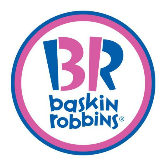
The world's largest ice cream chain is world-famous for offering 31 flavors of the tasty dessert. And their logo shows off their strong suit: the pink segments of the B and R form the number 31.
14. Pepsi
Pepsi spent $1 million to design their new logo in 2009, and that's before the cost of replacing every sign, billboard, machine, etc. to feature the new design.
So what's so special about it? The white part of the Pepsi "globe" has been redesigned to look like a smile.
But a 27-page report by Pepsi's ad agency says there's even more than meets the eye. They compare the logo to Earth's magnetic field, Chinese feng shui, Pythagorean math, geodynamics, and Einstein's theory of relativity.
No, we don't really get it either.
15. Tostitos
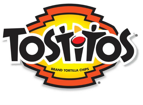
Who needs feng shui when you have a little creativity: the Ts in this chip brand's logo are a pair of people dipping Tostitos chips. That says everything you need to know about the product.
Did you already know any of these?
