You'll instantly recognize these logos because you've seen them thousands of times, but there's more subtlety to these seemingly simple designs.
These 10 clever hidden meanings in some of the most famous logos will leave you speechless and make you wonder how you've never noticed them before.
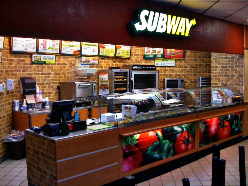
Subway
The arrow pointing left (S) and the arrow pointing right (Y) symbolize the entrance and exit doors of a Subway location.
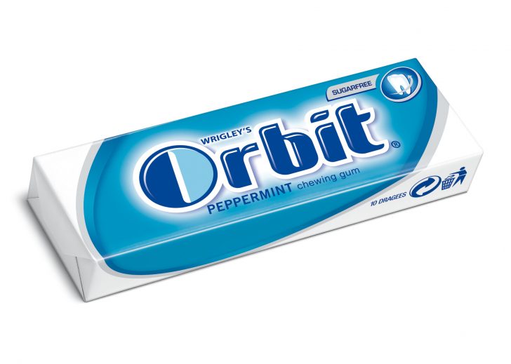
Orbit
Wrigley's Orbit gum really wants to hone in your mind that you'll always have fresh breath when you're chewing their product. The 'O' is dark on one side and light on the other. Do you get it? The logo symbolizes Earth's orbit around the sun!
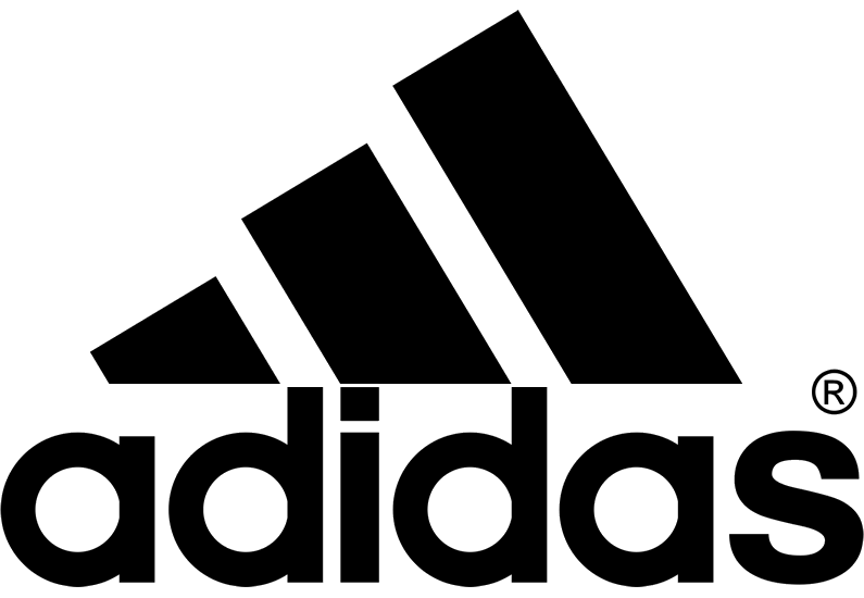
Adidas
The three black stripes above adidas, which look like a mountain, represent challenges we all must overcome. But the real question is, will wearing adidas help us overcome these challenges?
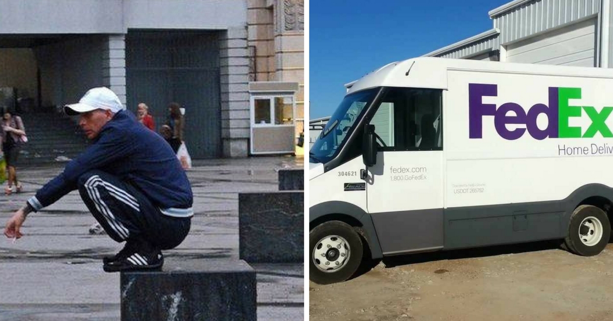
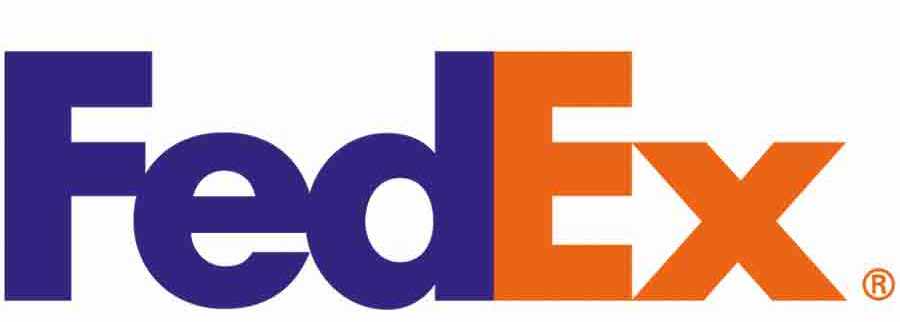
Fed Ex
There's nothing that this shipping company values more than delivering products with speed and accuracy. They care so much they've included it in their logo. Look closely and you'll be able to see an arrow between the 'E' and the 'X' that's pointing to the right.
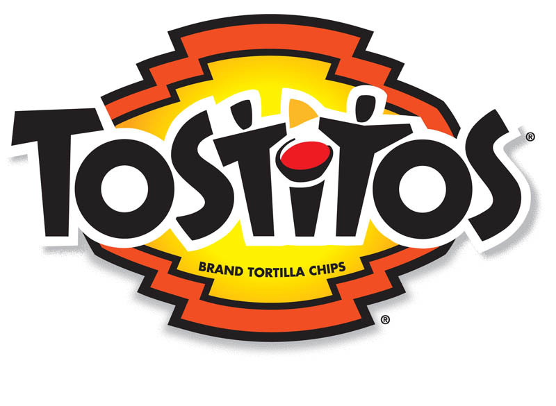
Tostitos
Tostitos knows that their products are always enjoyed in groups, so that's exactly what they incorporated in their branding logo. The two 'T's in the middle resemble two people sharing a one yellow Tostito chip. The red dot of the 'i' is a bowl of salsa.
You'll love to share these next ones with your friends!
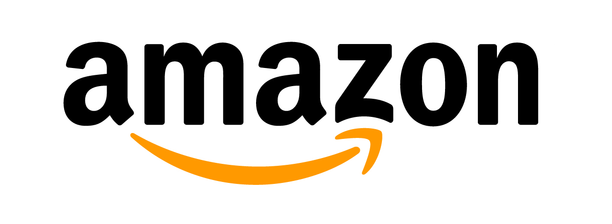
Amazon
The largest e-commerce company wants you to know that they have everything you'd possibly need on their website. How do they do this? Look at the arrow, they have everything from 'a' to 'z'.
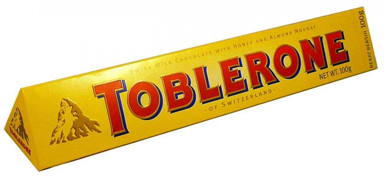
Toblerone
Most people don't know that Toblerone started in Bern, Switzerland, which is known for its majestic mountains. The city is also associated with bears. Can you see the outline of a bear on the mountain?
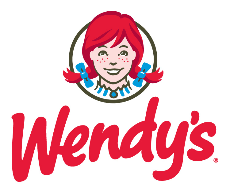
Wendy's
I doubt anyone goes to Wendy's because they want to have a meal that tastes like its been "home-cooked," but that's what the founder of the major fast food chain intended. Take a closer look at Wendy's collar, and you'll see the word "mom."
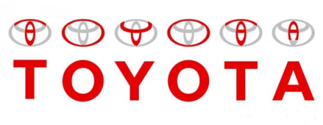
Toyota
This Japanese car manufacturer's logo shows how far it'll go to prove their unique design - just like their unique logo! Toyota said, "the three overlapping ovals on American vehicles symbolize the unification of the hearts of our customers and the heart of Toyota products. The background space represents Toyota's technological advancement and the boundless opportunities ahead." These overlapping ovals also spell out the company's name. That's pretty impressive!
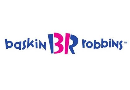
Baskin Robbins
The ice cream company prides itself so much on offering 31 different flavors that they've even included it in their logo. You can see the number 31 if you only focus on the pink color on the letters 'B' and 'R'.
How many of these did you know?
